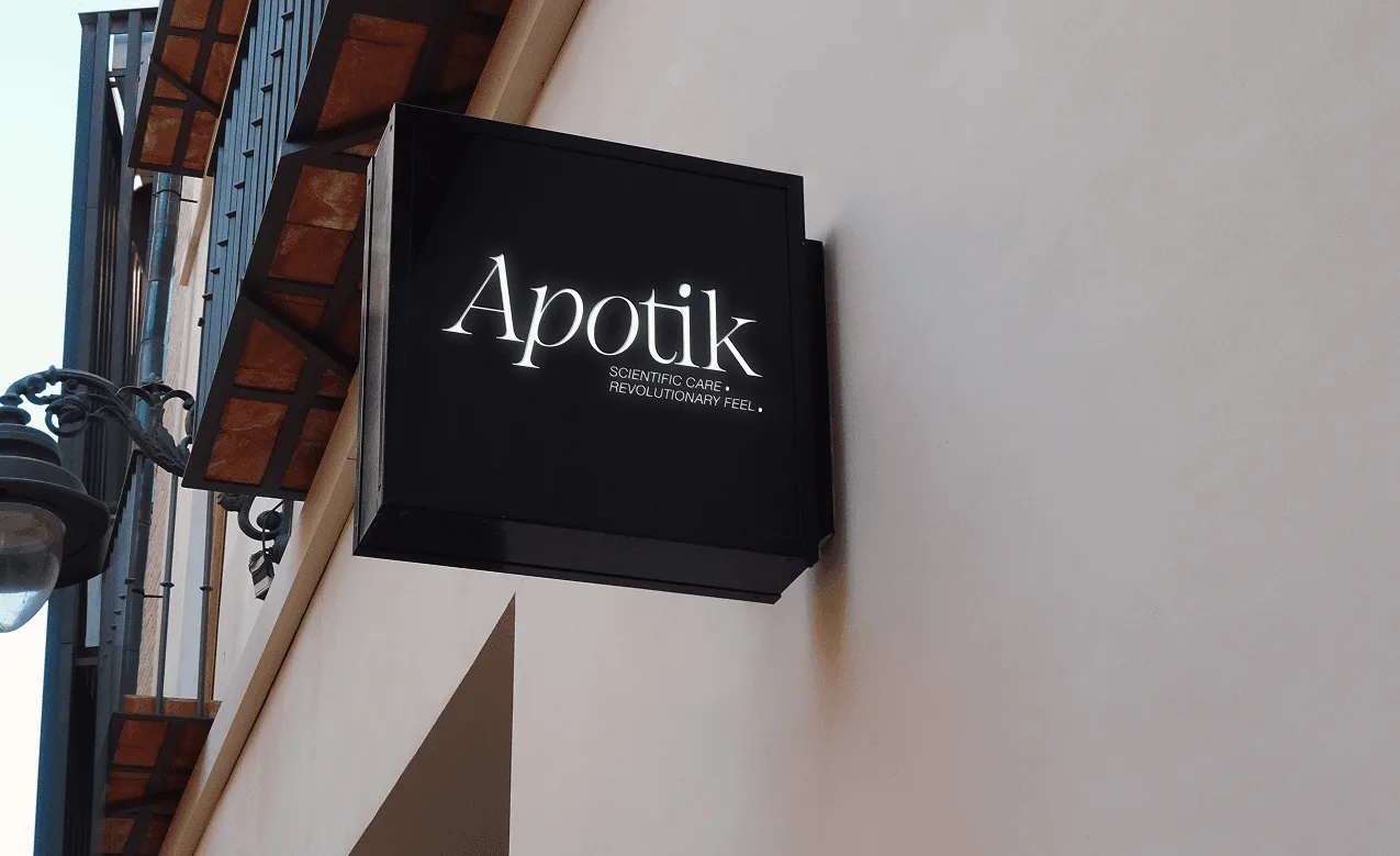
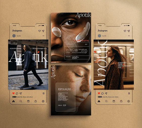
Apotik is positioned as more than an aesthetics clinic: a place where pharmaceutical knowledge, conscious self-care, and sensory detail meet. The work needed to feel credible without becoming cold, and warm without losing rigor.

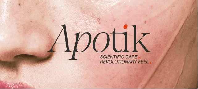




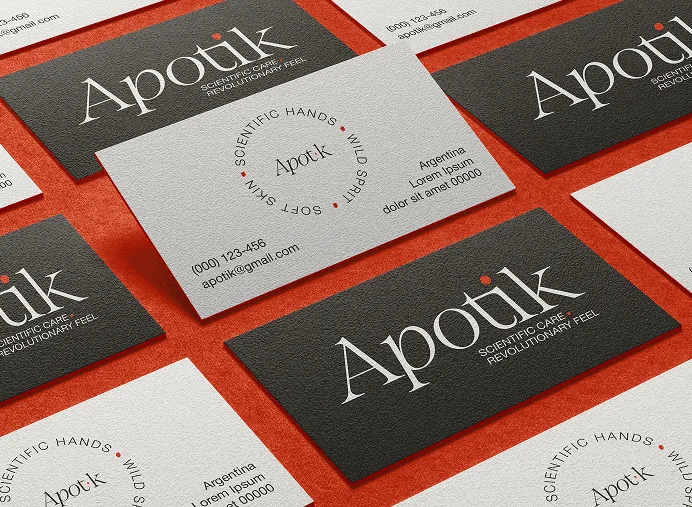
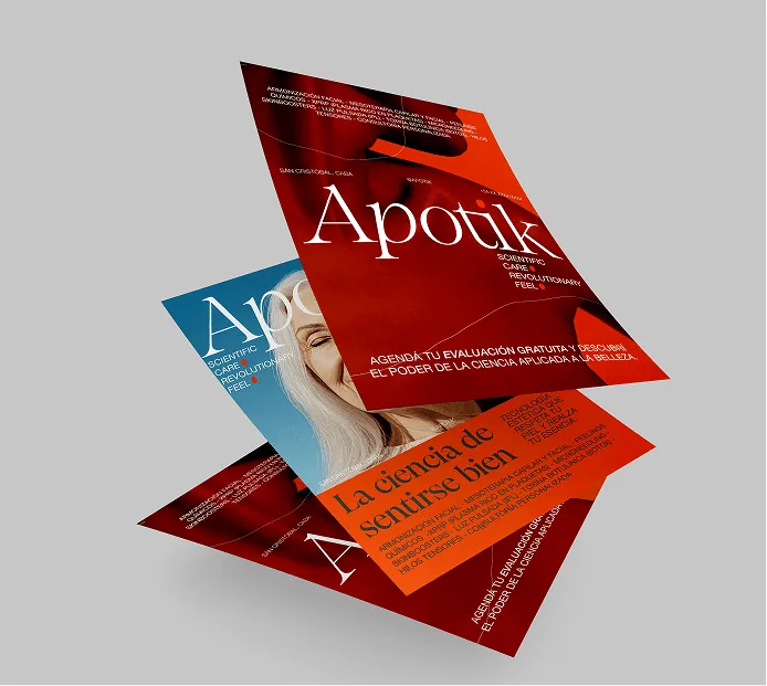
The system balances care with clarity: a lowercase logo, neutral palette, natural materials, and a first-person plural voice that invites people into a calmer form of self-care.
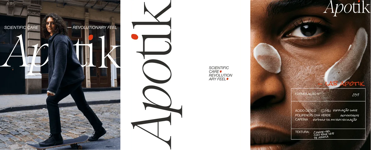
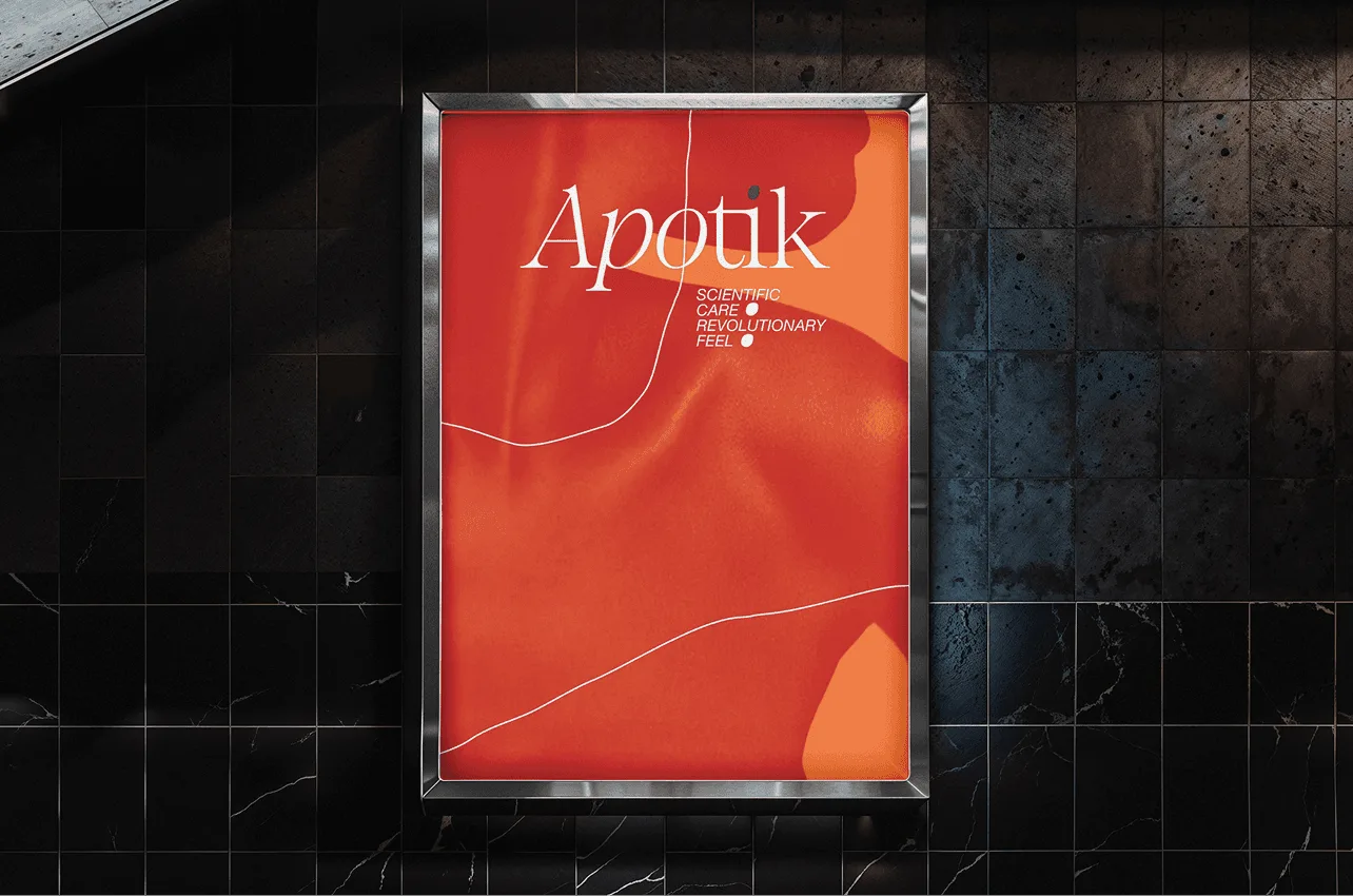

Source material and case-study imagery from Studio Latina. Project team: Julia Sprioli, Sol Paiva, and Camila Mai. Photography: Thomas Stange.